
Editing Luxury Listings Consistently: A Guide for Real Estate Photographers
Photo Editing
2026/09/21
When photographing a standard property, the goal is usually straightforward: create bright, clean, accurate images that clearly communicate the space. Luxury listings require all of that, but they also need something more. The photography has to communicate design, materials, architecture, atmosphere, and the premium character of the property.
A marble countertop should look like marble. Custom woodwork should retain its warmth and texture. Floor-to-ceiling windows should showcase the view without making the interior look artificial. Carefully designed lighting should contribute to the atmosphere rather than being completely neutralized during editing.
And all of those qualities need to remain consistent across the entire gallery.
That's why luxury real estate photo editing isn't simply about making images brighter or more dramatic. It's about creating a refined, repeatable visual standard that enhances the property without overpowering it.
For photographers and real estate media agencies handling high-end homes, here's how to maintain that standard from one image—and one luxury listing—to the next.
Why Consistency Matters More for Luxury Listings
Luxury properties are often marketed through a larger collection of visual assets.A listing may include extensive interior and exterior photography, detail shots, twilight images, aerial photography, virtual staging, floor plans, video, and other marketing materials. That creates more opportunities for visual inconsistencies.
Imagine scrolling through a luxury listing where the living room is bright and neutral, the kitchen is noticeably warmer, the primary bedroom is heavily contrasted, and the exterior suddenly has extremely saturated colors. Each image may look acceptable individually, but the gallery doesn't feel like one cohesive presentation.
Luxury photography should feel intentional from beginning to end. Consistency helps create that sense of refinement. Buyers aren't being shown a collection of unrelated photographs. They're being guided through the property visually.
Start With Consistent Capture Techniques
Editing consistency begins during the shoot. Luxury homes can be particularly challenging because they often include large windows, complex architectural lighting, reflective surfaces, open-plan interiors, and rooms with very different levels of natural light.
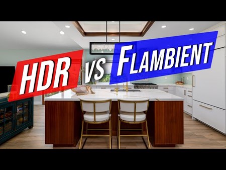
A predictable capture workflow gives your editor better material to work with. HDR photographers should use consistent exposure brackets. Flambient photographers should clearly capture and organize ambient, flash, and window exposures. Camera height and perspective should remain deliberate throughout the property.
Consistency doesn't mean using exactly the same settings in every room. A dark cinema room shouldn't be photographed exactly like a sun-filled kitchen. The objective is to use a repeatable decision-making process while adapting to the characteristics of each space. Better source files create more predictable editing.
Preserve the Property's Natural Atmosphere
One of the easiest mistakes in luxury real estate photo editing is trying to make every room equally bright. Luxury interiors are often intentionally designed around atmosphere.
A dramatic dining room may use warm pendant lighting and darker finishes. A home theater may intentionally feel moody. A spa-inspired bathroom may use soft indirect lighting. Brightening these spaces too aggressively can remove the atmosphere the designer intended to create. Consistency should therefore mean consistent quality, not identical brightness.
The editing should respect the character of each room while ensuring that the gallery still feels connected. A bright living area can remain bright. A darker lounge can retain its depth. What matters is that both images feel polished and deliberate.
Keep Colors Accurate
Color accuracy is important in any real estate listing, but it becomes especially important in luxury properties. High-end homes frequently use premium materials as major selling points: natural stone, hardwood, custom cabinetry, designer furniture, metallic finishes, specialty tiles, and carefully selected paint colors.
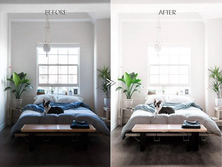
Overediting can distort those materials. Excessively warm white balance can make neutral stone look yellow. Too much saturation can change the appearance of wood or fabrics. Aggressive color correction can remove the subtle tones that make expensive finishes distinctive.
The goal should be enhancement without reinvention. Correct distracting color casts while allowing materials to retain their natural character. When photographing the same room from multiple angles, compare important surfaces between images. A kitchen island shouldn't appear warm beige in one photograph and cool gray in another. Those small inconsistencies become much more noticeable in a premium gallery.
Treat Window Views Carefully
Many luxury properties are valuable partly because of their location. Ocean views, mountains, city skylines, golf courses, gardens, and waterfront scenery may be among the property's strongest selling points. That makes window editing especially important.
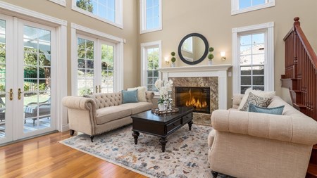
The temptation is to create extremely detailed window pulls so the exterior view becomes completely visible. But if the windows become too dark compared with the interior, they can look artificial. A strong window pull should reveal the view while maintaining a believable relationship with the room's lighting.
Windows are light sources. They should often remain somewhat brighter than the interior. For properties where the view is especially important, provide your editor with clear direction about which windows deserve additional attention. The goal is to showcase the scenery without making it look pasted onto the glass.
Maintain Consistency Across Large Open Spaces
Luxury homes frequently include large, connected living areas. A kitchen may flow directly into a dining room and living area, with several photographs covering the same space from different perspectives.
These images need particularly careful editing. If the white balance changes between angles, buyers may notice walls or cabinetry shifting color. If exposure varies too much, one side of the room may appear significantly darker in one image than another. Compare connected spaces as a group during post-production.
Look at walls, ceilings, flooring, furniture, and major architectural elements. Their appearance should remain consistent as the viewer moves through the gallery. This is one reason gallery-level quality control is so important for high-end properties.
Use Retouching With Restraint
Luxury listings often require more detailed retouching than standard properties. Small distractions can have a larger impact when the rest of the image is carefully composed.
Temporary items, cables, minor reflections, camera flashes, dust, or other visual distractions may need attention. But retouching should still respect the property.
The purpose is generally to remove distractions from the presentation—not to fundamentally change the home's permanent characteristics. Over-retouching can create images that feel artificial or misleading.
A useful principle is simple: the best retouching usually isn't the first thing viewers notice. They should notice the architecture, design, and atmosphere.
Keep Exterior Editing Refined
Luxury exterior photography often serves as the hero image of a listing. This makes it tempting to push the editing further: deeper blue skies, greener lawns, stronger contrast, and dramatic colors. Moderation usually produces a more premium result. Natural landscaping should retain believable tones. Architectural materials should maintain accurate colors. Skies can be enhanced when appropriate, but they shouldn't overpower the property.
Pay particular attention to consistency between exterior angles. If the sky and landscaping look dramatically different from one photograph to another, the gallery can quickly lose its polished feel. Luxury editing should generally feel controlled rather than exaggerated.
Make Day-to-Dusk Images Feel Premium
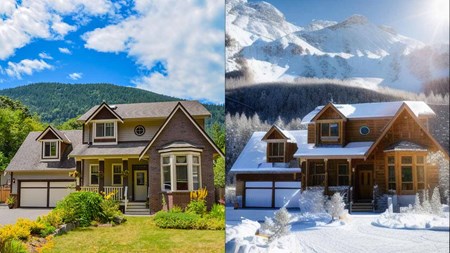
Day-to-dusk editing can be particularly effective for luxury homes. Pools, architectural lighting, landscaped gardens, large windows, and impressive exteriors can all become more dramatic during twilight. However, a luxury twilight edit shouldn't simply mean replacing the sky with the most colorful sunset available.
The sky, property lighting, reflections, landscape, and overall exposure need to work together. Interior lights should feel warm and inviting without becoming unnaturally orange. Exterior fixtures should appear believable. Reflections in pools or glass should complement the transformed environment. Most importantly, the property should remain recognizable. The transformation should enhance the architecture, not compete with it.
Keep Virtual Staging Consistent With the Property
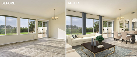
Virtual staging can help empty luxury properties communicate scale and lifestyle, but the furniture needs to match the level of the home. Generic furniture can feel out of place in a high-end interior. Furniture style, proportions, materials, colors, and placement should complement the property's architecture.
A contemporary penthouse may benefit from clean, modern furniture, while a luxury traditional home may require a completely different aesthetic. Lighting also matters. Virtually staged furniture should interact naturally with the existing room. Shadows, perspective, and brightness need to make the furniture feel like it belongs in the photograph. Consistency here means matching both the photography style and the character of the property.
Build a Luxury Editing Reference Library
If luxury properties are an important part of your business, create a dedicated reference library. Choose your strongest finished photographs and organize them by category: bright interiors, darker interiors, kitchens, bathrooms, exteriors, window pulls, twilight images, and other common situations. These references provide a clear visual target for editing. They become especially useful when outsourcing because terms such as "premium," "natural," or "luxury" are subjective.
A reference image removes much of that ambiguity. Instead of saying, "Make this feel more luxurious," you can show exactly how you prefer highlights, shadows, colors, and contrast to be handled.
Quality Control the Gallery, Not Just Individual Images
Luxury listings deserve a final gallery-level review. Instead of examining each image independently, scroll through the entire property in order. Look for sudden changes in brightness, color temperature, contrast, window treatment, and saturation.
Compare photographs of the same room. Check whether important materials maintain similar colors. Make sure exterior images feel connected to one another. Also consider the emotional flow.
Does the gallery begin strongly? Do interior photographs transition naturally? Do twilight or hero images feel like part of the same visual identity?
Consistency is often easier to recognize when you stop looking at individual adjustments and start experiencing the listing as a buyer would.
How CosyFoto Supports Consistent Luxury Real Estate Editing
As luxury photography volume grows, maintaining this level of post-production can become time-consuming. A high-end property may produce significantly more images than a standard listing, and techniques such as HDR and flambient can multiply the number of source files that need to be processed.
At CosyFoto, photographers can provide specifications for how they want their images handled, while the company's current service offering includes standard photo editing, retouching, Virtual Dusk, Virtual Staging, and Floor Plans. This combination can be useful for luxury listings because several types of post-production may be required within the same property.
Establish the Look Before Sending Large Volumes
Consistency becomes easier when expectations are established early. CosyFoto currently offers a free test with its photo editing service. Photographers can use this opportunity to evaluate how their preferred exposure, white balance, color, contrast, and overall style translate into an outsourced workflow.
For luxury work, use a representative image rather than the easiest photograph in your portfolio. Choose something with large windows, mixed lighting, premium materials, or another challenge typical of your high-end listings.
Then compare the result with your existing work and provide specific feedback. Establishing the standard first makes it easier to apply that direction across larger galleries later.
Keep Core Adjustments Consistent
CosyFoto's listed standard editing includes noise reduction and adjustments to white balance, contrast, exposure, lens correction, and color. Its retouching service can also address issues such as spots, glare, reflections, and other image details.
These are exactly the small technical areas where inconsistency can become noticeable across a large luxury gallery. The objective shouldn't be to make every image identical. Instead, establish consistent principles: accurate colors, controlled highlights, believable shadows, straight architecture, natural windows, and a polished overall finish.
Keep Advanced Services Within the Same Visual Direction
A luxury property may need standard editing for most images, detailed retouching for selected photographs, virtual staging for an empty room, and a Virtual Dusk transformation for the hero exterior. CosyFoto offers these services within its broader real estate post-production offering. The important part is maintaining the same visual direction across them.
Provide references for twilight style. Explain the furniture aesthetic expected for virtual staging. Identify important materials that need accurate color representation. Advanced editing should expand the marketing possibilities of the listing without making individual images feel disconnected from the rest of the gallery.
Add Editing Capacity Without Giving Up Your Style
CosyFoto currently says it works 24/7 and lists standard photo editing from $0.70 per image, with 12–24-hour image delivery for that service. For photographers and media agencies handling large luxury properties, external editing capacity can reduce the amount of post-production that needs to happen after a long shooting day.
But outsourcing should never mean surrendering your visual identity. Reference galleries, detailed preferences, and ongoing feedback allow the photographer to remain responsible for the creative direction while the editing partner supports production. That's particularly important in luxury real estate, where your editing style may be part of why an agent hired you in the first place.
Final Thoughts
Consistent luxury real estate photo editing isn't about making every photograph brighter, more saturated, or more dramatic.
It's about control. Colors should accurately represent premium materials. Window views should be visible without appearing artificial. Darker spaces should retain atmosphere. Retouching should remove distractions without changing the character of the property. Virtual staging and day-to-dusk images should complement the same visual story.
Most importantly, the complete gallery should feel intentional. Establish a repeatable shooting process, create luxury-specific reference images, communicate your standards clearly, and review the property as a complete gallery before delivery. As your workload grows, a post-production partner such as CosyFoto can help provide additional editing capacity while your references and instructions continue to guide the finished look.
Luxury properties may all be different, but the standard behind your photography shouldn't be. Different architecture. Different atmosphere. The same attention to detail.
 alt="">
 alt="">
 alt="">
 alt="">
 alt="">
 alt="">
 alt="">
 alt="">