
How to Create a Consistent Editing Style Across Every Listing
Photo Editing
2026/08/17
In real estate photography, taking great photos is only half the job. The way those photos are edited plays an equally important role in how clients perceive your work. A single beautifully edited image may impress an agent, but delivering the same recognizable quality across every room, property, and photoshoot is what builds a professional photography brand.
That's where consistent real estate photo editing becomes important.
When buyers scroll through a listing, the images should feel like they belong together. Lighting shouldn't suddenly shift from warm to cool. Walls shouldn't appear cream in one photo and bright white in another. Some rooms shouldn't look heavily processed while others appear flat and unfinished.
For photographers, consistency extends beyond a single property. Clients should know what to expect every time they book a shoot. Whether you're photographing a small apartment on Monday or a luxury property on Friday, your editing style should remain recognizable.
Creating that consistency isn't always easy, particularly as your workload grows. Here's how to develop a reliable editing style that works across every listing without making every property look exactly the same.
1. Define What Your Editing Style Actually Looks Like
Before you can achieve consistency, you need to know what "consistent" means for your photography. Many photographers develop their style naturally over time without clearly defining it. They may know when an image looks right, but explaining exactly why can be difficult.
Start by reviewing some of your best completed galleries. Look for characteristics that appear repeatedly. Are your interiors bright and airy or slightly warmer and more atmospheric? Do you prefer neutral whites or preserve some warmth from interior lighting? How much contrast do you normally use? How saturated are exterior greens and blues? Your answers begin to form your editing identity.
For real estate photography, a strong style doesn't necessarily need to be dramatic. In fact, natural and predictable results are often more valuable than highly stylized editing. The objective is to showcase each property accurately while maintaining a recognizable visual standard. Once you've identified that standard, it becomes much easier to reproduce.
2. Keep Exposure Consistent Across the Entire Gallery
One of the quickest ways to make a real estate gallery feel inconsistent is uneven exposure. Imagine viewing a listing where the living room is bright and open, the kitchen is noticeably darker, and the next bedroom suddenly appears extremely bright. Even if each image looks acceptable individually, the gallery won't feel cohesive.
Consistent exposure doesn't mean every room needs exactly the same brightness. A naturally dark home theater shouldn't look identical to a sun-filled living room. Instead, the editing should respect the property's actual lighting while maintaining a comfortable visual flow between images.
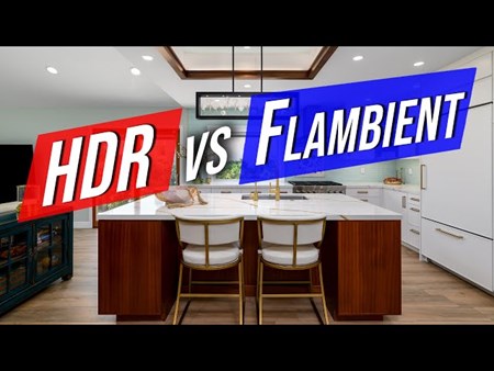
This is especially important with HDR real estate photography. Combining multiple exposures gives editors significant control over brightness, but pushing every image to its maximum brightness can make interiors appear flat or unrealistic. Good consistent real estate photo editing maintains detail in both highlights and shadows while preserving the natural character of each space.
3. Pay Close Attention to White Balance
White balance is one of the most challenging aspects of interior real estate photography. A single room can contain daylight from windows, warm ceiling lights, cool LED fixtures, and reflections from colorful furniture or walls. Cameras often capture these competing light sources as unwanted color casts.
Professional editing helps neutralize those casts, but consistency matters.
If walls appear neutral in one photograph and yellow in the next, buyers may wonder which image accurately represents the property. The same issue can occur with cabinets, flooring, ceilings, and other surfaces.
The goal isn't to remove every trace of warmth. Doing so can make interiors feel sterile. Instead, editors should establish a natural balance that keeps important surfaces accurate while preserving the atmosphere of the room.
Maintaining this approach across the entire gallery creates a much more polished presentation.
4. Create Consistent Colors Without Oversaturating
Color is another major part of your editing identity. Exterior photos often contain green lawns, blue skies, colorful landscaping, and warm architectural materials. It's tempting to increase saturation to make these elements stand out, but too much enhancement can quickly make real estate images look artificial.
The same principle applies indoors. Wood flooring shouldn't suddenly become orange, neutral furniture shouldn't take on strong color casts, and paint colors should remain reasonably close to reality.
Developing consistent color standards helps prevent these problems. Decide how vibrant you want greens and blues to appear, how much warmth you prefer in interiors, and how strongly you want certain colors corrected. Once these preferences are established, they should carry across every listing.
Consistency builds trust because clients know the photographs will look polished without becoming unrealistic.
5. Keep Vertical Lines Straight
Real estate photography relies heavily on architecture, which means perspective problems are particularly noticeable. Walls, door frames, cabinets, and windows should generally appear vertical. When one image has perfectly straight lines while another appears tilted, the difference can make an otherwise professional gallery feel unfinished.
Wide-angle lenses make this particularly challenging because even small changes in camera position can introduce perspective distortion. Correcting vertical lines during editing creates a cleaner, more architectural look and should become a standard part of your workflow rather than an occasional correction.
The important thing is consistency. Similar types of images should receive similar perspective treatment across every property. These small technical details often separate professional galleries from average ones.
6. Develop a Standard Approach to Window Pulls
Window pulls are another area where editing styles can vary dramatically. Some photographers prefer extremely clear exterior views, while others maintain brighter windows that more closely reflect natural indoor lighting. Neither approach is automatically correct, but constantly switching between styles can make a gallery look inconsistent.
A natural window pull should generally preserve exterior detail without making the window appear like a television screen placed on the wall. Brightness, contrast, reflections, and color should work with the interior rather than competing against it.
Establishing a standard approach to window pulls helps editors know exactly how much exterior detail you prefer and how bright windows should remain. This is particularly important when outsourcing because window pull preferences can be highly personal.
7. Standardize Your Exterior Editing
Your editing style shouldn't disappear when you step outside. Exterior photos should follow the same philosophy as your interiors. If your brand is built around clean, realistic photography, extremely saturated blue skies and fluorescent green lawns may feel disconnected from the rest of your portfolio.
Consider how you want skies, landscaping, shadows, driveways, and building materials to appear. Sky enhancement should complement the property rather than dominate it. Grass enhancement should restore healthy-looking greens without creating an unrealistic lawn. Shadows should contain enough detail without eliminating the direction of natural light.
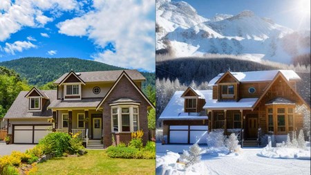
For day-to-dusk editing, consistency becomes even more important. Sunset colors, window lighting, exterior lights, and overall brightness should follow a recognizable style across different properties. These standards create a portfolio that feels intentional rather than randomly edited.
8. Build Presets, but Don't Depend on Them Completely
Lightroom presets can be extremely useful for creating consistent real estate photo editing. A good preset provides a starting point for exposure, contrast, highlights, shadows, sharpening, color adjustments, and other common settings. Applying the same foundation across multiple shoots can significantly speed up your workflow. However, presets aren't a one-click solution.
Every property has different lighting, paint colors, window placement, furniture, and weather conditions. Applying identical settings without making individual adjustments can create inconsistent results rather than prevent them. Think of presets as a foundation rather than a finished edit. They help establish your visual direction, but an experienced photographer or editor should still evaluate every image individually.
9. Create an Editing Style Guide
If you're editing everything yourself, you may not think you need a style guide. But as soon as another editor joins your workflow, having documented preferences becomes extremely valuable. An editing style guide doesn't need to be complicated. It can include before-and-after examples along with simple instructions describing your preferred brightness, white balance, contrast, window pulls, exterior colors, vertical correction, and other important details.
Visual examples are particularly useful because editing terminology can be subjective. "Bright" may mean one thing to you and something completely different to another editor. Showing an editor exactly what you want removes that uncertainty. As your preferences evolve, update your examples. Over time, this becomes a reliable reference that helps maintain your style regardless of who processes the images.
10. Use Reference Images for Quality Control
One of the easiest ways to maintain consistency is to compare new work against previous galleries. Choose several images that represent your ideal editing style. These can include a typical living room, kitchen, bedroom, exterior, window pull, and perhaps a day-to-dusk image. Use these photographs as visual references during quality control.
Before delivering a new gallery, compare the overall brightness, colors, contrast, and finishing style with your references. The properties won't look identical—and they shouldn't—but the editing philosophy should feel similar. Reference images are particularly valuable when working with an outsourced editing team because they provide a clear quality benchmark.
Why Consistency Becomes Harder as Your Business Grows
Maintaining a consistent style is relatively manageable when you're photographing only a few properties each week. As your business grows, the situation changes. More clients mean more shoots, more images, tighter deadlines, and less time available for detailed post-production. Editing late at night after a full day of photography can also lead to inconsistency simply because of fatigue.
If you add additional photographers to your team, the challenge becomes even greater. Different cameras, shooting techniques, and exposure preferences can produce very different source files. A standardized editing workflow becomes the common layer that brings everything together.
This is one reason growing real estate photography businesses often outsource post-production. A dedicated editing partner can apply the same standards across large image volumes while photographers focus on shooting and client relationships.
How Outsourcing Can Improve Editing Consistency
Some photographers worry that outsourcing means losing control over their style. With the right editing partner, the opposite can be true. A professional editing team can learn your preferences and reproduce them across every project. Instead of changing your editing decisions depending on how tired or busy you are, your images follow an established workflow.
The key is communication. Provide clear reference images, explain what you like and dislike, and give detailed feedback during the early stages of the partnership. Small revisions help editors understand your preferences until the process becomes increasingly predictable. Over time, the editing team becomes an extension of your photography business rather than simply an external service.
Consistency Doesn't Mean Every Property Should Look the Same
This distinction is important. A consistent style shouldn't erase the personality of individual properties. A bright coastal home should still feel different from a traditional house with warm wood interiors. A luxury downtown condo shouldn't be forced into exactly the same color palette as a countryside property. Consistency is about how you edit, not forcing every property toward the same appearance. Your standards for natural colors, balanced exposure, straight verticals, realistic windows, and overall polish can remain consistent while allowing each home's architecture and atmosphere to come through. The best real estate editing enhances what's already there rather than imposing a look that doesn't belong.
How CosyFoto Helps Maintain a Consistent Editing Style
At CosyFoto, we understand that photographers aren't simply outsourcing individual images—they're trusting an editing partner with their brand.
That's why personalized editing preferences are an important part of creating reliable results. By working from your references and feedback, an editing workflow can be developed around the look you want to deliver to your clients. From HDR enhancement and window pulls to perspective correction, color balancing, object removal, day-to-dusk transformations, and virtual staging, the objective is to produce polished images while maintaining a natural and consistent appearance.
For photographers managing a growing number of listings, professional editing can also help remove post-production bottlenecks without sacrificing the recognizable style clients expect. The result is a more scalable workflow and a consistent experience across every property you deliver.
Final Thoughts
Creating consistent real estate photo editing isn't about applying the same preset to every image. It's about developing clear visual standards and applying them thoughtfully across different properties and lighting conditions.
Exposure, white balance, colors, vertical lines, window pulls, exterior enhancement, and advanced editing should all feel like parts of the same visual language. When those elements remain consistent, individual photographs come together to create polished galleries—and multiple galleries come together to create a recognizable brand. For real estate photographers, that consistency can become a competitive advantage. Agents know what they'll receive every time they book you, portfolios look more professional, and your business becomes easier to scale.
Whether you edit everything yourself or work with a professional editing partner, the goal remains the same: create images that feel natural, polished, and unmistakably yours. With the right workflow - and the right editing support - you can deliver that quality across every listing, every time.
 alt="">
 alt="">
 alt="">
 alt="">
 alt="">
 alt="">
 alt="">
 alt="">